Friday, 31 May 2013

butter London: No More Waity, Katie

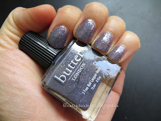
Today I have butter London's No More Waity, Katie.  I was partially inspired to do a swatch since there's a new colour to add to the names inspired by the Royals.  I own two of them, one is No More Waity, Katie and Lillibet's Jubilee.  

No More Waity, Katie is one of my first butter London polishes.  This was near Will and Kate's wedding, and I also ordered All Hail the Queen during my first purchase.

Thoughts
I rarely wore this because there's glitter in the polish and at the time I didn't wear non-office appropriate polish to the office.  I have worn this on my toes and I remember it didn't last that long.  It could have been a combination of my shoes but the entire layer with the glitter came off.

One thing I noticed about doing this swatch is that the colour and the glitter is pretty sparce.  So it took me three coats to get it fully opaque and to have all the glitter evenly distributed.

Personally, while the idea of the polish is fun, I mean the name for one thing, and purple with glitter.  I'm not sure how I feel towards it.  I normally don't like adding three layers of polish.  Also, I don't actually find the polish to be very special.  Right now, taking another look at this polish, it kind of reminds me of the new Hard Candy glitter polishes.  The difference is the price though. 

Breakdown
Basecoat: butter London Nail Foundation
Colour layer: butter London No More Waity, Katie (three coats)
Topcoat: butter London Hardwear


Cap off


I ordered No More Waity, Katie at butterlondon.ca.  It costs C$17.00 and shipping is extra.  Also available on nailpolishcanada.com

Wednesday, 29 May 2013

butter London: Lillibet's Jubilee

In trying to bring out the butter London polishes I own for the new polish, though I don't own that...yet.  Today I have Lillibet's Jubilee.  


Thoughts
Lillibet's Jubilee is a silvery lavender metallic polish.  When I first bought this last fall, I definitely expected it to be more lavender than silver, but at least in the description it does list it as silvery lavender, so I guess that's ok.  The bottle itself looks more like lavender tone.  Anyway, the colour is very pretty.  I received a compliment at work since it was different.  I wore a topcoat but since it's a foil, the finish was very interesting.  The application is pretty smooth and easy.  It was pretty opaque after one coat, I added another to even out the polish.

When I wore this, it did chip after one day.  Somehow I ignored the chip and wore it for a whole work week anyway.  

Breakdown
Basecoat: butter London Nail Foundation
Colour layer: butter London Lillibet's Jubilee (two coats)
Topcoat: butter London Hardwear

Brush shot

One coat of polish

Closer look at one coat

Two coats and top coat

Two coats and top coat with flash

Another flash picture since I did this swatch right after the sun went down

Final picture with flash

I bought this polish at nailpolishcanada.com.  I bought the Backstage Basics and selected this one to be my colour choice.  The set is C$46 and qualifies for free shipping. (I'm just saying this because I think it's a good deal.  I don't work for nailpolishcanada.  Sometimes I feel like I'm selling their site but I'm not trying to).

Monday, 27 May 2013

Warm Shades: Favourite Spring/Summer colours (so far)

Since I started this blog in January, I'm pretty surprised that I've kept up with it.  Though, my original plan was to just display the collection I had and try not to buy anymore.  Though I knew my weakness would really shine through during my busy season at work, and the spring/summer collection.  I buy a lot of colours during the spring because it's my most stressful time at work and I just like the fresh colours spring has to offer.  

This weekend I decided to paint my nails with Essie's Madison Ave-hue.  I received a lot of compliments today, so I decided to do my top spring picks that I have been wearing a lot so far.  I usually paint my nails a new colour on Sundays for the weekday.  If for whatever reason the polish chips badly midweek or I don't feel like wearing that colour anymore, I'd just take it off and not have anything until Sunday.

1. Essie - Madison Ave-hue
I usually wear neutral colours for work, but as I said in my review, I am obsessed about this colour.  I picked it up on a whim. I just saw the silver fine glitter and decided to give it a try.  To be honest, I'm surprised/shocked at how much I love this hot pink.  I've worn this on my toes at least twice.  Each time I've painted my toes with Madison Ave-hue, the colour has lasted for two weeks (Seche Vite top coat).  Though of course there's some nail growth but that can't be helped.  


I decided paint this on my fingers this week, and I received so many compliments.  Though, I work in an office environment where only a selected few people actually paint their nails, so this bright colour is pretty eye catching.  I have worn other eye catching colours but I didn't receive any compliments for those, which means this colour was a good choice. Two ladies picked up my hand to examine the colour.  Another asked which brand I was wearing.  Oh, office life.  I wanted a different type of picture, so I took it with my Starbucks cup.


2. OPI - Roll in the Hague
Another colour I didn't expect to like and I'm not sure why I picked it up.  I did and I'm so glad I did!

I usually wear this polish on my toes.  Last year, I just reapplied this polish when it grew out.  During my trip to Cuba in the fall, I had also painted my toes with this colour.  As soon as I knew I was going to a sunny destination, I could only think of this colour for my toes.  After doing the swatch below for my review, I really loved the way it looked on my fingers.  So, I wore it to work last week.  Again wearing this in an office environment is pretty eye catching.  I only received one compliment, which means it was not that well received but I don't care, I love it.

The only down side is it stains a little.  I had forgotten about that, so it's not in my review.  Last year, I had removed this polish before going to the salon and the lady giving me a pedicure suggested that I used a base coat to protect my nails.  I always use a base coat, so it must mean that the removal process involves a little staining.  It doesn't really bother me though.

On my toes, this has last two weeks and for my fingers, it lasted at least four days with minimal chipping.  The topcoat I used was Seche Vite.


During a dark/muggy day, the polish did look a little darker than it really was.  My friend thought I switched polishes but it was the same colour.


3. Rescue Beauty Lounge - Santa Fe
I received this in the mail at the end of March, so it's not something that I've worn as frequently as the first two, but I have worn this on my toes and fingers already.  Also after doing the swatch I just loved how this looked.  The nice thing about Santa Fe is that it's not too eye catching.  I definitely wore this to the office before wearing Roll in the Hague.  The colour itself is subtle, and the warm earthy tone makes Santa Fe more office appropriate than Roll in the Hague.  I'm not sure if that matters to be honest.

I do realize that Santa Fe might not be for everyone given the price and ordering online.  I bought it and I am happy with it.


Thank you for reading my favourite spring/summer colours so far.

Thursday, 23 May 2013

Sally Hansen: Insta-dry Blue-Away

I have another blue colour to share today.  I found this at Wal-Mart and decided to give it a try since it looks like sky blue.  Sometimes I feel like I'm on a quest to find the perfect blue.  I mean, I've found many blues like this but I guess I'll always be searching for another one even if I found the perfect colour.  

Thoughts
I don't often by Sally Hansen because I have so many other colours already.  I have other Sally Hansen's that I really like.  I'll have to swatch those at a later date.  Anyway, it's been so long since I had a Sally Hansen that I didn't even remember how the feeling was to paint with this.  My friend absolutely loves this line of nail polish.  She has a few Chanel's but she prefers this one more.  She likes the brush and the fact that she doesn't have to use a top coat.  Most of my friends don't use a base or top coat.

My initial thoughts were brush is a little uneven and feels like a fluffy brush, not as stiff as my other high end brands but I really shouldn't compare.  However, I realized that I was able to control the strokes and I didn't get much polish on my skin, that is always my goal even if I fail.  I should really talk about the dry time since it's part of the name but I didn't count how long it took.  I do remember that these dry pretty quickly compared to other polishes.

Breakdown
Base coat: Nicole by OPI Base Coat Plus
Colour Coat: Sally Hansen Insta-dry Blue-Away (2 coats)
Top coat: Nicole by OPI Top Coat Plus


The size of the bottle is 9.17mL.  I bought this at Wal-Mart, and it retails for C$3.97.  This is also available at Shoppers Drug Mart.

Tuesday, 21 May 2013

Comparison: Essie Turqquoise & Caicos, First Timer and Mojito Madness

This might be late but I actually took these photos awhile ago, just because I wanted to know how First Timer compared to Turquoise & Caicos as well as Mojito Madness.  Here are the pictures.  If I could describe (I might not be very good with my colours), Turquoise & Caicos is definitely lighter and looks more mint next to First Timer.  

First Timer is lighter than Mojito Madness.  Seems like there's more..yellow..in it?  This describing the differences in colour is really difficult for me.


Here are the swatches, all with three coats!


All bottles were bought by me. :)

Sunday, 19 May 2013

Cirque: Cape Liz

Aside from my order from Mei Mei Signatures of Fleur es Belle, I decided order from the Cirque official website.  I sometimes feel bad because the whole purpose of my blog is to use the colours I already own and to stop buying more polishes.  I have totally failed because I practically bought at least one polish from the Spring collections that have come out, or decided that I wanted to try different brands.  Well Cirque is one of them.  One day I was looking around online and I found some pictures of Cape Liz and XX, so I ordered both of them.  They arrived pretty quickly too.   I'll show XX in another post.  Both are from the Objet d'Art collection.  


Thoughts
The reason I bought Cape Liz was because I was looking for some blues/greys and this looked like it had a lot of shimmer in it.  While applying, there are shimmers but I also found for me personally it was hard to even out the polish.  The shimmer is pretty apparent though.  It's like blue/silver flakes  I've swatched this twice, once to actually wear but I layered it on too thick, so I didn't end up wearing it.  So I don't know if there is a consistency issue for me, but some nails turned out more thick than my other fingers.  It was weird for me.  I would say the formula is medium/thick.  I'm beginning to think I have problems applying medium/thick polishes, because that seems to be my #1 complaint.  

Overall, I think the colour is very pretty.  Definitely in my colour range of blue/grey colours.  It's got flakes so what's not to love?  I also found removal a little difficult.  The flakies stick, but that's true for all glitter and flakes.  I used a Quo brand nail container, which is a jar with a sponge soaked in nail polish remover and you dip your finger into it.

Breakdown
Base coat: Nicole by OPI Base Coat Plus
Colour Coat: Cirque Cape Liz (2 coats)
Top coat: Nicole by OPI Top Coat Plus


Brush shot

The beautiful flakes


I bought Cape Liz on the Cirque website for U$13.  Shipping to Canada wasn't bad, I bought two polishes and shipping came to U$8.

Comparisons
L to R: Illamasqua Raindrops, Cirque Cape Liz, Cult Nails Disciplined

Close up of Illamasqua's Raindrops

Close up of Cirque's Cape Liz

Close up of Cult Nails' Disciplined

L to R: Illamasqua's Pink Raindrops (oops, it got into the camera angle), Illamasqua's Raindrops, Cirque's Cape Liz and Cult Nail's Disciplined

L to R: Illamasqua's Raindrops, Cirque's Cape Liz and Cult Nail's Disciplined

Closer look: L to R: Illamasqua's Raindrops, Cirque's Cape Liz and Cult Nail's Disciplined

Illamasqua's Raindrops is more jelly like with silver flakes, also it would be more of a light grey.  Cirque's Cape Liz has more blue in it and the flakes are different silver/blue.  Cult Nails is an opaque grey and the shimmer is like purple/pink/blue.  They are all quite different.